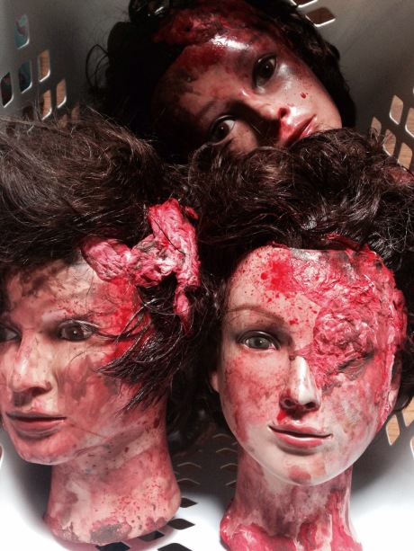
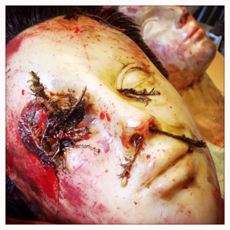
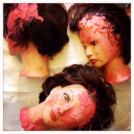
Here is my 16th image of my self portrait zombie series, and the second in my House of Horror theme. For this image, I designed the House of Horror Hair Price Menu, and the Coagulation Magazine. Other images in my zombie series are Picnic, Make a Wish, Theatre Popcorn, Home Cookin’, Take Time To Smell The Roses, Alone Time, Pancake Breakfast, Time for Tea, House of Horror Hair, Scared of the Dark, The Sleepover, Fun in the Sun, Luau Party, It’s a Girl!, and It’s a Girl! The Cake.
Archives for posts with tag: bounce card
This photograph was taken for an assignment this semester in my Photographic Illustration class. For this assignment we had to select a tear sheet of a commercially taken image that we wished to reproduce; lighting patterns, style, and overall feel. I chose my tear sheet from a home ware section of a department store’s catalog, and purchased as similar of items as I could find both for my ceramics and my propping. I used multiple hot lights to create my lighting direction and patterns, and multiple bounce cards to add or subtract light. The image at the bottom is the tear sheet that I used as inspiration for my image.
This was an image taken this current Fall Semester in my Photographic Illustration class for our second Self Proposal Assignment. In this assignment we were allowed to photograph anything of our choosing, as long as we presented the instructor with a sketch of our idea first. Since we were encouraged to photograph something that we would want to show potential clients, I chose a detailed table top set up shot in studio. I am always fascinated by the puzzle of prop placement in a photograph. For this image I wanted to use a lot of small elements, but also allow the image to come across as simple in design.
This is an image I created using the Photoshop techniques for compositing that I have learned over several classes. This image is made up of 12 independent images that I have merged together to create this one image. I achieved this image by first photographing the doll with the purple bow in the center of the image, and used her to determine my base exposure for the whole scene. As I took each frame, I left my main light in the same position and left this doll in the center as a reference point. I then began to place one doll at a time and take two photographs of each one; one using the base exposure and one with a fill card placed close to the added doll. Using this method would allow me to have each doll properly exposed for the scene, but also allow the shadowed area to open up. Without using compositing, this image would not be possible. One of the reasons is that this image is only made up of three different dolls. So by compositing different photographs together I was able to fill my scene with the appearance of 6 dolls. I also would not have been able to get a fill card as close to each doll as I needed to open up the shadowed areas. Below are a few examples of the original photos before editing and compositing.
This is an image taken in a lab for my Photographic Illustration class this current Fall Semester. During this lab I was assigned to be in a group with Kelly and Michael, and only had a few hours to complete the given assignment. For this image, we had to purchase a glass bottle beverage, and photograph it looking cold. We backlit the bottle with a large soft box, and placed a light to camera left diffused by a large scrim. This final image is a composite of three images; one image for the background exposure, one for the bottle, and one for the cap. The appearance of condensation on the bottle was achieved by spraying the bottle with a mixture of water and glycerin.
This was an image taken this current Fall Semester in my Photographic Illustration class for our second Self Proposal Assignment. In this assignment we were allowed to photograph anything of our choosing, as long as we presented the instructor with a sketch of our idea first. Since we were encouraged to photograph something that we would want to show potential clients, I chose a detailed table top set up shot in studio. This shoot was my second time using a tilt shift lens, and I like how I was able to change the plane of focus to include both a close front focus and back to include most of the label while using a very shallow depth of field. The combination of the tilt shift lens and the aperture setting allowed for the background objects to bokeh out beautifully.
This is a portrait of my friend and fellow photography student, Joe, taken for my Photographic Illustration class this semester. The assignment was to photograph an editorial head and shoulders business portrait on a solid white background. I chose to light Joe with a shoot through umbrella on a Broncolor Light positioned at camera right, and a large piece of white foam core used as a bounce card at camera left. The background was lit independently using a Soft Box on a Broncolor Light pointed at the background, and placed directly behind Joe. Joe and I worked together on choosing his clothing, which helped give the portrait a more professional business feel.


